CambridgeSeven’s work is on display at Boston, New York exhibitions
Boston Business Journal - October 12, 2023
Architecture firm that designed T map, logo featured in exhibits
By Grant Welker – Projects Reporter, Boston Business Journal

Around Boston, CambridgeSeven’s work can be seen at the One Dalton tower in Back Bay or at the Boston Children’s Museum.
These days, the firm has other work on display in a very different way.
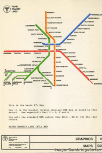
CambridgeSeven’s 1960s-era designs for the MBTA — including the creation of the T logo and its rapid transit map — went on display last month at the Boston Public Library as part of an exhibit showing maps of Boston-area transit over the centuries. Just a week later, the Museum of Modern Art in New York opened with a CambridgeSeven-produced drawing of a model rainforest as it appeared in Osaka, Japan. The work was part of an initiative to highlight the environment and ecology and is part of an exhibit of more than 150 pieces highlighting architects’ work addressing environmental concerns from the 1930s to the ‘90s.
“It was completely happenstance that it happened at the same time,” principal Patti Intrieri said of the library and MoMA exhibits.
The MBTA work will be instantly recognizable to anyone who’s taken the transit system, whether or not they’ve ever stopped to think of its design.
The T, which dates to the late 1800s as North America’s first subway system, only emerged with its present-day moniker and design in the 1960s. CambridgeSeven was hired to create branding and a simplification of its four rapid-transit lines that until then weren’t color-coded or as easy to follow.
CambridgeSeven studied different transit systems in Europe and found that many branded themselves with a single letter. It turned out that none in the United States had
done so with a T.
“It was all about simplifying it to make it easy for people to understand it,” said Justin Crane, another CambridgeSeven principal. “Boston is confusing enough as it is.” The system map was far simpler in those days, with no geographic markers such as waterways or bus lines to add complexity.
“The original one was really just a geographic design of where people needed to go and where stations connected,” Intrieri said.
MoMA reached out to CambridgeSeven a year and a half ago for an exhibit it was looking to do on architecture and environmentalism. A curator there was familiar with CambridgeSeven because the firm designed the New England Aquarium, Crane said.
Peter Sollogub, an associate principal who drew the rainforest image roughly three decades ago, said the work was meant to evoke the fragility of the rainforest and what could be lost when it disappears.
He had forgotten all about the work, which he said eventually got lost in a file drawer in the firm’s offices.
“It’s an honor to be on display as part of an exhibit like that,” he said.